基础知识定义
background-clip 设置元素的背景(背景图片或颜色)是否延伸到边框、内边距盒子、内容盒子下面。
语法
background-clip: border-box; // 背景延伸至边框外沿(但是在边框下层)
background-clip: padding-box; // 背景延伸至内边距(padding)外沿。不会绘制到边框处
background-clip: content-box; // 背景被裁剪至内容区(content box)外沿
background-clip: text; // 背景被裁剪成文字的前景色
如果没有设置背景图片(background-image)或背景颜色(background-color),那么这个属性只有在边框( border)被设置为非固实(soild)、透明或半透明时才能看到视觉效果(与 border-style 或 border-image 有关),否则,本属性产生的样式变化会被边框覆盖。
默认情况下,背景的颜色会延伸至边框下层,这意味着我们设置的透明边框效果会被覆盖掉,在css3中,我们可以通过设置background-clip:padding-box来改变背景的默认行为,达到我们想要的效果。
示例代码
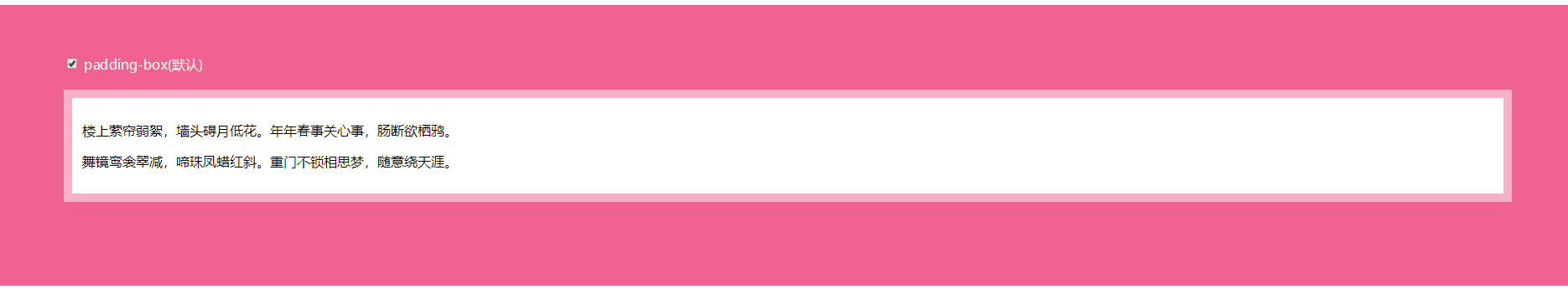
<body>
  <main>
    <input id="pb" type="checkbox" checked/>
    <label for="pb">padding-box(默认)</label>
    <div>
      <p>楼上萦帘弱絮,墙头碍月低花。年年春事关心事,肠断欲栖鸦。</p>
      <p>舞镜鸾衾翠减,啼珠凤蜡红斜。重门不锁相思梦,随意绕天涯。</p>
    </div>
  </main>
</body>
body{
  width: 100%;
}
main{
  padding: 60px 80px 80px;
  background: #F06292;
}
div{
  padding: 12px;
  margin: 20px auto;
  background: white;
  border: 10px solid hsla(0, 0%, 100%, .5);
}
label{
  color: #f4f0ea;
}
input[id="pb"]:checked ~ div{
  background-clip: padding-box;
}
这种效果实现方法其实有很多种,用background-clip只是其中之一,本篇文章主要是让大家知道background-clip的作用,用法。
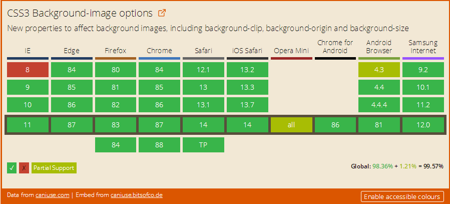
浏览器兼容
正文结束
图片

 表情
表情Ctrl + Enter