前言
有了之前的两章,小伙伴们对按钮悬浮动画是否又有了新的认识呢?
前面两章主要是从背景着手,而本章主要是围绕边框动画做效果。并且,本章节(按钮组:有趣的CSS按钮动画,带你进入CSS世界)也就到此结束了,本章结尾会对前3小节进行一定的总结。
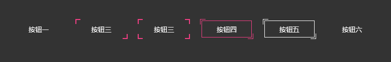
下面继续本小节的主题,请先看一下效果示例:

看过前两小节的小伙伴,可能不需要看下面的源码,就知道如何实现了,大家可以先自己动手试试,然后再回头来看看。或许实现方式不一样,但只要能实现,都是好方法。
下面对示例讲解
示例一
<button class="btn-1">按钮一</button>

<style>
button{
  position: relative;
  width: 100px;
  height: 40px;
  background: none;
  cursor: pointer;
  color: #fff;
  border: none;
  margin-right: 20px;
  margin-bottom: 20px;
}
button:before,
button:after{
  position: absolute;
  content: '';
  width: 100%;
  height: 100%;
  z-index: 10;
  transition: all .5s;
}
/* 按钮一 */
.btn-1:before, .btn-1:after{
  height: 2px;
  left: 50%;
  width: 0;
  background: #f13f84;
  transform: translateX(-50%);
}
.btn-1:before{
  top: 0;
}
.btn-1:after{
  bottom: 0;
}
.btn-1:hover:before,
.btn-1:hover:after{
  width: 100%;
}
</style>
解析:
1、:before top为0,:after bottom为0,高度height: 2px,而宽度为0,并且水平居中
2、在绝对定位的作用下,:hover改变:before、:after的宽度,即可形成上图效果
示例二
<button class="btn-2">按钮二</button>

<style>
...
/* 这里省略上方的公共样式 */
.btn-2{
  background: #333;
  height: 36px;
}
.btn-2:before,
.btn-2:after{
  width: 10px;
  height: 10px;
  background: #f13f84;
  mix-blend-mode: hue;
}
.btn-2:before {
  left: -2px;
  top: -2px;
}
.btn-2:after {
  right: -2px;
  bottom: -2px;
}
.btn-2:hover:before,
.btn-2:hover:after{
  height: calc(100% + 4px);
  width: calc(100% + 4px);
}
</style>
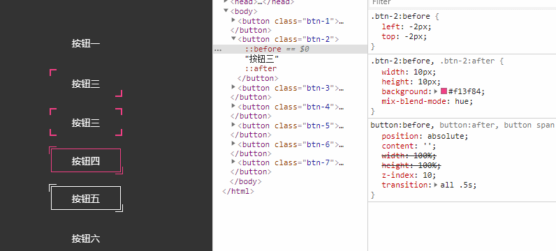
解析:
1、:before、:after,超出button 2px
2、:hover时改变:before、:after宽高,这里宽高用到了calc()
calc() 函数用于动态计算长度值。
● 需要注意的是,运算符前后都需要保留一个空格,例如:width: calc(100% - 10px);
● 任何长度值都可以使用calc()函数进行计算;
● calc()函数支持 “+”, “-”, “*”, “/” 运算;
● calc()函数使用标准的数学运算优先级规则;
3、大家应该都留意到了上图中,特意操作了一个属性mix-blend-mode,它在这里的作用让button的背景显示出来覆盖在:before、:after背景色的上方。
css3 mix-blend-mode语法
mix-blend-mode:normal | multiply | screen | overlay | darken | lighten | color-dodge | color-burn | hard-light | soft-light | difference | exclusion | hue | saturation | color | luminosity
hue 色相模式 “色相”模式只用“混合色”颜色的色相值进行着色,而使饱和度和亮度值保持不变。
这里就不具体讲述mix-blend-mode,希望后面能用一章来专门讲解。
示例三
<button class="btn-3">
  <span>按钮三</span>
</button>

<style>
...
/* 这里省略上方的公共样式 */
button span:before,
button span:after{
  position: absolute;
  content: '';
  width: 100%;
  height: 100%;
  z-index: 10;
  transition: all .5s;
}
.btn-3{
  background: #333;
  height: 36px;
}
.btn-3:before,
.btn-3:after,
.btn-3 span:before,
.btn-3 span:after{
  width: 10px;
  height: 10px;
  background: #f13f84;
  mix-blend-mode: hue;
}
.btn-3:before {
  left: -2px;
  top: -2px;
}
.btn-3:after {
  right: -2px;
  top: -2px;
}
.btn-3 span:before {
  left: -2px;
  bottom: -2px;
}
.btn-3 span:after {
  right: -2px;
  bottom: -2px;
}
.btn-3:hover:before,
.btn-3:hover:after,
.btn-3:hover span:before,
.btn-3:hover span:after {
  height: 60%;
  width: 60%;
}

解析:

 表情
表情