前言
前面文章《CSS3线性渐变、阴影、缩放实现动画下雨效果》实现了下雨的动画效果,现在我们来绘制更多天气相关的动态图标。
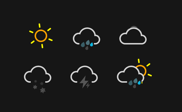
上图6种天气,我们就分开一一展示给小伙伴们,希望能给大家带来帮助。
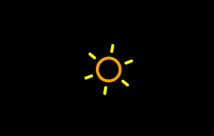
晴朗
<div class="icon sunny">
  <div class="sun">
    <div class="rays"></div>
  </div>
</div>
sun标签绘制圆环,rays及其伪类绘制射线,然后添加动画,其实旋转。
body {
  background-color: currentColor;
}

.sun {
  width: 2.5em;
  height: 2.5em;
  margin: -1.25em;
  background: currentColor;
  border-radius: 50%;
  box-shadow: 0 0 0 0.375em orange;
  animation: spin 12s infinite linear;
}

.rays {
  position: absolute;
  top: -2em;
  left: 50%;
  display: block;
  width: 0.375em;
  height: 1.125em;
  margin-left: -0.1875em;
  background: yellow;
  border-radius: 0.25em;
  box-shadow: 0 5.375em yellow;
}

.rays:before, .rays:after {
  content: '';
  position: absolute;
  top: 0em;
  left: 0em;
  display: block;
  width: 0.375em;
  height: 1.125em;
  transform: rotate(60deg);
  transform-origin: 50% 3.25em;
  background: yellow;
  border-radius: 0.25em;
  box-shadow: 0 5.375em yellow;
}
.rays:before {
  transform: rotate(120deg);
}

@keyframes spin {
  100% {
    transform: rotate(360deg);
  }
}
下雨
<div class="icon rainy">
  <div class="cloud"></div>
  <div class="rain"></div>
</div>
body {
  background-color: currentColor;
}
.cloud {
  position: absolute;
  z-index: 1;
  width: 3.6875em;
  height: 3.6875em;
  margin: -1.84375em;
  background: currentColor;
  border-radius: 50%;
  box-shadow:
    -2.1875em 0.6875em 0 -0.6875em,
    2.0625em 0.9375em 0 -0.9375em ,
    0 0 0 0.375em lightgray,
    -2.1875em 0.6875em 0 -0.3125em lightgray,
    2.0625em 0.9375em 0 -0.5625em lightgray;
}

这朵云是不是怪怪的,下边应该是平整的,所以添加样式。
.cloud:after {
  content: '';
  position: absolute;
  bottom: 0;
  left: -0.5em;
  display: block;
  width: 4.5625em;
  height: 1em;
  background: currentColor;
  box-shadow: 0 0.4375em 0 -0.0625em lightgray;
}

这里绘制云,和《CSS3线性渐变、阴影、缩放实现动画下雨效果》一样的,都是用box-shadow阴影来制作的。
然后我们加入雨滴
...
.rain{
  position: absolute;
  z-index: 2;
  top: 50%;
  left: 20%;
  width: 3.75em;
  height: 3.75em;
  margin: 0.375em 0 0 -2em;
  background: currentColor;
}

.rain:after {
  content: '';
  position: absolute;
  z-index: 2;
  top: 50%;
  left: 50%;
  width: 1.125em;
  height: 1.125em;
  margin: -1em 0 0 -0.25em;
  background: #0cf;
  border-radius: 100% 0 60% 50% / 60% 0 100% 50%;
  box-shadow:
    0.625em 0.875em 0 -0.125em rgba(255,255,255,0.2),
    -0.875em 1.125em 0 -0.125em rgba(255,255,255,0.2),
    -1.375em -0.125em 0 rgba(255,255,255,0.2);
  transform: rotate(-28deg);
  animation: rain 3s linear infinite;
}
@keyframes rain {
  0% {
    background: #0cf;
    box-shadow:
      0.625em 0.875em 0 -0.125em rgba(255,255,255,0.2),
      -0.875em 1.125em 0 -0.125em rgba(255,255,255,0.2),
      -1.375em -0.125em 0 #0cf;
  }
  25% {
    box-shadow:
      0.625em 0.875em 0 -0.125em rgba(255,255,255,0.2),
      -0.875em 1.125em 0 -0.125em #0cf,
      -1.375em -0.125em 0 rgba(255,255,255,0.2);
  }
  50% {
    background: rgba(255,255,255,0.3);
    box-shadow:
      0.625em 0.875em 0 -0.125em #0cf,
      -0.875em 1.125em 0 -0.125em rgba(255,255,255,0.2),
      -1.375em -0.125em 0 rgba(255,255,255,0.2);
  }
  100% {
    box-shadow:
      0.625em 0.875em 0 -0.125em rgba(255,255,255,0.2),
      -0.875em 1.125em 0 -0.125em rgba(255,255,255,0.2),
      -1.375em -0.125em 0 #0cf;
  }
}
还有人记得《CSS3绘制一个小雨滴,见证它的成长之路》,其实很多东西都是一点点积累的过程,慢慢的拼凑,会得到不一样的东西。

如果你对box-shadow动画还不是很熟悉的,可以看这里《CSS3 box-shadow实现背景动画》
多云
多云,这个云前面已经制作了,接下来就非常的简单。
<div class="icon cloudy">
  <div class="cloud"></div>
  <div class="cloud"></div>
</div>
这里两朵云,前面的是静止的,后面的是动态的。
body {
  background-color: currentColor;
}
.cloudy {
  position: absolute;
}
.cloud {
  position: absolute;
  z-index: 1;
  width: 3.6875em;
  height: 3.6875em;
  margin: -1.84375em;
  background: currentColor;
  border-radius: 50%;
  box-shadow:
    -2.1875em 0.6875em 0 -0.6875em,
    2.0625em 0.9375em 0 -0.9375em ,
    0 0 0 0.375em lightgray,
    -2.1875em 0.6875em 0 -0.3125em lightgray,
    2.0625em 0.9375em 0 -0.5625em lightgray;
}
.cloud:after {
  content: '';
  position: absolute;
  bottom: 0;
  left: -0.5em;
  display: block;
  width: 4.5625em;
  height: 1em;
  background: currentColor;
  box-shadow: 0 0.4375em 0 -0.0625em lightgray;
}
.cloud:nth-child(2) {
  z-index: 0;
  background: #fff;
  box-shadow:
    -2.1875em 0.6875em 0 -0.6875em #fff,
    2.0625em 0.9375em 0 -0.9375em #fff,
    0 0 0 0.375em #fff,
    -2.1875em 0.6875em 0 -0.3125em #fff,
    2.0625em 0.9375em 0 -0.5625em #fff;
  opacity: 0.3;
  transform: scale(0.5) translate(6em, -3em);
  animation: cloud 4s linear infinite;
}
@keyframes cloud {
  0% {
    opacity: 0;
  }
  50% {
    opacity: 0.3;
  }
  100% {
    opacity: 0;
    transform:
      scale(0.5) translate(-200%, -3em);
  }
}

下雪
“北国风光,千里冰封,万里雪飘。…一代天骄,成吉思汗,只识弯弓射大雕。俱往矣,数风流人物,还看今朝。”,一提到雪,顿时想起毛爷爷的《沁园春·雪》,豪情万丈啊。继续正题。
<div class="icon flurries">
  <div class="cloud"></div>
  <div class="snow">
    <div class="flake"></div>
    <div class="flake"></div>
  </div>
</div>
添加样式
body {
  color: #161616;
  font-family: 'Roboto', sans-serif;
  background-color: currentColor;
}

.flurries {
  position: absolute;
  top: 50%;
  left: 55%;
}
.snow {
  position: absolute;
  z-index: 2;
  top: 50%;
  left: 20%;
  width: 3.75em;
  height: 3.75em;
  margin: 0.375em 0 0 -2em;
  background: currentColor;
}
.cloud {
  position: absolute;
  z-index: 1;
  width: 3.6875em;
  height: 3.6875em;
  margin: -1.84375em;
  background: currentColor;
  border-radius: 50%;
  box-shadow:
    -2.1875em 0.6875em 0 -0.6875em,
    2.0625em 0.9375em 0 -0.9375em ,
    0 0 0 0.375em lightgray,
    -2.1875em 0.6875em 0 -0.3125em lightgray,
    2.0625em 0.9375em 0 -0.5625em lightgray;
}
.cloud:after {
  content: '';
  position: absolute;
  bottom: 0;
  left: -0.5em;
  display: block;
  width: 4.5625em;
  height: 1em;
  background: currentColor;
  box-shadow: 0 0.4375em 0 -0.0625em lightgray;
}
.cloud:nth-child(2) {
  z-index: 0;
  background: #fff;
  box-shadow:
    -2.1875em 0.6875em 0 -0.6875em #fff,
    2.0625em 0.9375em 0 -0.9375em #fff,
    0 0 0 0.375em #fff,
    -2.1875em 0.6875em 0 -0.3125em #fff,
    2.0625em 0.9375em 0 -0.5625em #fff;
  opacity: 0.3;
  transform: scale(0.5) translate(6em, -3em);
  animation: cloud 4s linear infinite;
}
.flake:before,
.flake:after {
  content: '\2745';
  position: absolute;
  top: 50%;
  left: 50%;
  margin: -1.025em 0 0 -1.0125em;
  color: #fff;
  list-height: 1em;
  opacity: 0.2;
  animation: spin 8s linear infinite reverse;
}
.flake:after {
  margin: 0.125em 0 0 -1em;
  font-size: 1.5em;
  opacity: 0.4;
  animation: spin 14s linear infinite;
}
.flake:nth-child(2):before {
  margin: -0.5em 0 0 0.25em;
  font-size: 1.25em;
  opacity: 0.2;
  animation: spin 10s linear infinite;
}
.flake:nth-child(2):after {
  margin: 0.375em 0 0 0.125em;
  font-size: 2em;
  opacity: 0.4;
  animation: spin 16s linear infinite reverse;
}

@keyframes spin {
  100% {
    transform: rotate(360deg);
  }
}
这里云依旧,雪花采用字体图片形式,用font-family:'Roboto', sans-serif;,content: '\2745';即可出现雪花。旋转动画和太阳旋转动画一样。
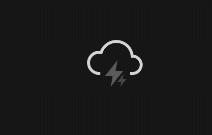
雷电
<div class="icon thunder-storm">
  <div class="cloud"></div>
  <div class="lightning">
    <div class="bolt"></div>
    <div class="bolt"></div>
  </div>
</div>
把cloud的样式复制下来,制作闪电lightning就可以了。
body {
  background-color: currentColor;
}
.thunder-storm {
  position: absolute;
}
.cloud{
  ...
}
...
...

.lightning{
  position: absolute;
  z-index: 2;
  top: 50%;
  left: 20%;
  width: 3.75em;
  height: 3.75em;
  margin: 0.375em 0 0 -2em;
  background: currentColor;
}
.bolt {
  position: absolute;
  top: 50%;
  left: 50%;
  margin: -0.25em 0 0 -0.125em;
  color: #fff;
  opacity: 0.3;
  -webkit-animation: lightning 2s linear infinite;
          animation: lightning 2s linear infinite;
}
.bolt:nth-child(2) {
  width: 0.5em;
  height: 0.25em;
  margin: -1.75em 0 0 -1.875em;
  transform: translate(2.5em, 2.25em);
  opacity: 0.2;
  animation: lightning 1.5s linear infinite;
}

.bolt:before,
.bolt:after {
  content: '';
  position: absolute;
  z-index: 2;
  top: 50%;
  left: 50%;
  margin: -1.625em 0 0 -1.0125em;
  border-top: 1.25em solid transparent;
  border-right: 0.75em solid;
  border-bottom: 0.75em solid;
  border-left: 0.5em solid transparent;
  transform: skewX(-10deg);
}
.bolt:after {
  margin: -0.25em 0 0 -0.25em;
  border-top: 0.75em solid;
  border-right: 0.5em solid transparent;
  border-bottom: 1.25em solid transparent;
  border-left: 0.75em solid;
  transform: skewX(-10deg);
}
.bolt:nth-child(2):before {
  margin: -0.75em 0 0 -0.5em;
  border-top: 0.625em solid transparent;
  border-right: 0.375em solid;
  border-bottom: 0.375em solid;
  border-left: 0.25em solid transparent;
}
.bolt:nth-child(2):after {
  margin: -0.125em 0 0 -0.125em;
  border-top: 0.375em solid;
  border-right: 0.25em solid transparent;
  border-bottom: 0.625em solid transparent;
  border-left: 0.375em solid;
}
@keyframes lightning {
  45% {
    color: #fff;
    background: #fff;
    opacity: 0.2;
  }
  50% {
    color: #0cf;
    background: #0cf;
    opacity: 1;
  }
  55% {
    color: #fff;
    background: #fff;
    opacity: 0.2;
  }
}
雨转晴
最后的雨转晴也就超级简单了,把太阳和下雨天合并到一起就可以了。
<div class="icon sun-shower">
  <div class="cloud"></div>
  <div class="sun">
    <div class="rays"></div>
  </div>
  <div class="rain"></div>
</div>
样式上面添加一点点错位就可以了。其余的云,雨样式直接复用上面的即可。
...
.cloud + .sun {
  margin: -2em 1em;
}
...
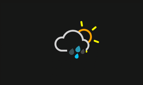
并且通过这个例子,我们可以引申很多天气出来,多云转雨、雷雨、雨夹雪等等。
演示地址:css3简易的天气图标动画特效
推荐文章
《CSS3线性渐变、阴影、缩放实现动画下雨效果》
《CSS3绘制一个小雨滴,见证它的成长之路》
《CSS3 box-shadow实现背景动画》

 表情
表情